
Mood + Design
Mood + Design
October 12, 2022 | by: PNa Interiors Team: Allison Furlan, Mae Myers, Olivia Hrinko
![]()
![]()
Design can directly influence our behavior or mood. When designing an interior space, there are a lot of different factors that can change the way a person interacts with the space. Natural & artificial light, color, texture, and acoustics are all things designers must consider when trying to evoke a certain emotion from the users. Our job is to design and create spaces that will leave a positive impact in the way you view space and the emotions that you associate with it.
Visualizing the different colors, textures, sounds, and light allows the user to create an escape and be transported elsewhere. Color is fundamental to our experience of the world around us. How we perceive and experience food, fashion, a flashy billboard or even a space is greatly impacted by color. Why are museum walls commonly white? Why are red and yellow used in almost every fast-food chain? Why does a ripe yellow banana look more appealing than a green or brown one? Because color shapes our world and our emotions.
Commercial Environments
Commercial spaces take a different approach to setting a specific mood which can vary greatly depending on the type of space, the client, location, and target demographic. The new design for Split Rail winery has certainly taken the age-old adage of using color to evoke a certain feeling within a space. As you drive down Chinden you can’t help but notice the hot pink and electric blue accents on the exterior of the new Split Rail winery tasting room in Garden City (Architecture by Pivot North, Interiors by KovichCo). The simple but striking exterior beckon you into this lively and boisterous space and invite you to sit down and enjoy a glass of wine, or two.
The vibrancy of this venue continues into the Interiors with bold furniture choices, quirky artwork and experimental wines that lends itself to the overall eclectic ambiance. The owners had a clear vision in mind of what this space needed to feel like and how the design of the space could support their story of creating unique wine. “Split Rail winery is propagated by the minds of a new generation of drinker. We create wine that is spawned from whimsy and redolent of the soil that we stand upon. Let us bring the farm to your glass; bring Idaho soil to your lips.”
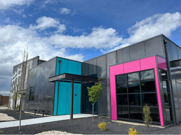
The use of bold, fluorescent colors were strategically used throughout the large tasting room to create a young and fresh atmosphere that is welcoming to all. These saturated and high-intensity hues wouldn’t be my first selection for say a calming meditation studio or serious office space, but they are perfectly suited for this energetic winery. The uniqueness of this winery doesn’t stop with the interior design, everything from the intriguing flavor profiles to the graphic design on the bottles and wine names supports the overall branding and feel of this spirited winery. I highly recommend the “2019 Swamp Donkey” or “2019 Daft Pink Rose”.
This space was designed to cater to all senses, not only sight, and taste of course. Acoustics are a major component in making a space not only functional but to help evoke a sense of privacy versus animation. The large volume of this space certainly had acoustics in mind but not so much so that we can hear a pin drop or a conversation across the room. What we are left with is a louder, yet manageable, buzzing that creates a feeling of liveliness and activity. If the space had too many acoustic baffles or surfaces to reduce the amount of reverberation you would feel more like you were in a library than a bustling winery.
Large volumes and an abundance of natural light in the space also aid to the lively nature of this winery. If this space had say no windows it would have a much different feeling. Instead you get sunlight streaming into the space with views of the outdoor patio and food truck and bustling street views versus a space with no windows that feels more introverted and intimate.
From the noises of friends laughing and catching up over a bottle of wine huddled around a neon yellow table to the art deco inspired bathroom complete with quirky Barbie artwork this winery can’t help but make you feel invigorated, upbeat, and social all with a bit of whimsy.
Learning Environments
Learning environments try to elicit specific types of emotions, geared towards creating a productive environment for inspiring minds and stimulating the learning process. In this middle school we will see how color, lighting and biophilic design merge to achieve this.
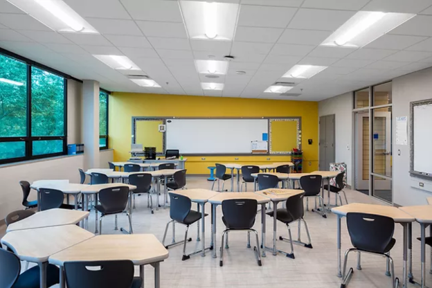
To create a clean and comfortable environment geared towards students, the use of pops of color in medium-saturated hues of yellow, turquoise and orange, paired with a bright neutral + natural base palette is utilized throughout the entire school. Whereas softer hues create a calmer atmosphere and highly saturated colors can be overly stimulating, the mid-level saturation is great for students. The colors used provide a lively environment without over excitement.
The classroom’s full glass aluminum framed entry doors and expanded full glass sidelights provide a visual connection to the rest of the school while allowing natural light from the exterior window wall to penetrate into the interior corridors and make additional connections to nature. The sloped ceiling reinforces this idea and establishes a subtle flow from exterior to interior. The accent walls on the teaching walls in shades of yellow and orange create a positive, inspiring and stimulating environment for learning.
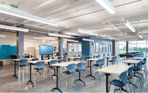
The STEM classrooms take advantage of a vivid blue accent color, expansive views to the outdoors, and pendant fixtures on an open structure ceiling to create a more industrial feel. High-top mobile seating and tables promote flexibility for student collaboration. The space is flooded with natural light and provides a learning environment that is stimulating and induces a sense of curiosity and productivity, perfect for focusing on higher level learning practices.
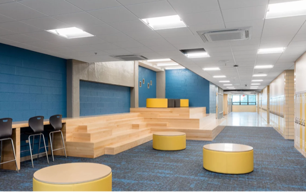
Common areas and corridor nodes combine the color palette into a single space, along with natural wood elements to successfully bring the interiors vision together. From nearly every space in the school, there is a connection to natural elements and lighting as well as an emotion provoking pop of color. The factors combined create a productive environment for inspiring minds while stimulating the learning process.

Healthcare Environments
Walking into a healthcare facility can draw out different emotions for different people. A patient’s natural response may be anxiety or fear-based, depending on the reason for a visit. A clinic should elicit emotions of calmness, serenity and peace to help offset other natural, unfavorable emotional responses. This can be done with color, texture, imagery and a connection to nature.
By incorporating natural elements, directly and indirectly, it gives us the connection to nature that humans inherently desire. With the use of soft blues and greens, designers can create a calming space infused with nature while maintaining a sense of freshness and order. Adding in the use of natural textures like wood, creates an environment that feels grounded and stable. Actual biophilic objects are another major factor in healthcare design. It has been scientifically proven that hospital stays and rates of healing are directly impacted in a positive manner when a patient has direct access or views of nature, plants or healing gardens and abundant natural light.
Imagine walking into a doctor’s office and the paint being dark grey or accented with highly saturated colors, with no natural light. This is not a scene that evokes a sense of healing or cleanliness. Even the hue of color is important. Yellow or gold walls can reflect their color onto patient’s skin making them appear sickly, even when they are not. Dark colors can feel oppressive and overwhelming.
Incorporating artwork and imagery into the space is another important factor to bring out feelings of serenity and a distraction from reality. Organic images of fine detail, landscapes that reflect on the surrounding, familiar terrain and colorful images are all great examples of using imagery to transport patients to a sense of peace while waiting or receiving a procedure. An effectively designed space will transport the patients and allow their mind to roam and wander like a nature hike through the foothills of Boise, watching the golden grass sway in the wind as it brushes alongside a wooden fence post. As you read the previous statement you can see the imagery in the soft curves of the furniture, the textural fabric, the organic mossy likeness in the carpet and the landscape photography in the image below.

There are many aspects to creating a specific mood or emotion when designing a space. Color, texture, shape and the connection, or lack of, to nature are just a few that help shape the designed space. No matter what mood you want to elicit, there is a way to achieve it. Just ask the interiors team at Pivot North!